5 Aesthetic Apartment Decor Mistakes That Ruin Everything — And Exactly How to Fix Them
Aesthetic apartment decor usually goes wrong when everything is competing for attention—too many colors, too much small decor, mismatched furniture, poor lighting, or pieces that don’t fit the room properly. The fix is often to remove a few things rather than buy more.
Start by simplifying the color palette, improving the lighting, and giving your furniture and decor some breathing room. Once the basics feel balanced, a few favorite pieces will stand out much better
Why Your Aesthetic Apartment Looks Great in Photos but Feels Chaotic in Person
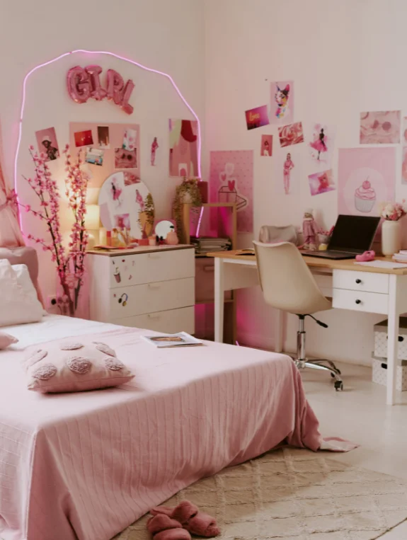
You’ve spent real time and real money making your apartment look good. It photographs beautifully. But walking around in it every day feels off — busy, scattered, never quite right.
The problem almost never comes down to what you bought. It comes down to a few invisible habits that quietly work against everything else.
The Disconnect Between Your Pinterest Board and Your Actual Apartment
The rooms you save feel calm, intentional, and effortlessly beautiful.
Your apartment has similar pieces — similar colors, similar style — but it never quite lands the same way. That gap isn’t about budget or taste. It’s about one or two specific choices that change how the entire space registers in your brain. This post names all five of them.
Most People Make These Mistakes Without Realizing They Are Doing It
These aren’t obvious failures. They’re invisible habits that sneak in gradually.
One extra object on a shelf here. A mismatched frame there. The overhead light left on out of convenience. None of them feel significant in the moment.
Together they create a room that feels chaotic no matter how much effort went into it. Once you see them, the fixes become obvious — and most of them are free.
The 5 Mistakes That Make Any Apartment Look Cluttered
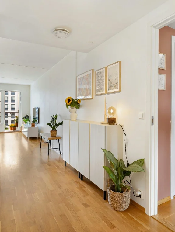
- Too Many Small Objects on Surfaces — Fix: One object per surface maximum
- Mismatched Frame Colors and Materials — Fix: Two frame finishes throughout the entire apartment only
- Overhead Light Instead of Layered Warm Lighting — Fix: Overhead light off, warm lamps at different heights always
- Wall Decor Too Small for the Space — Fix: One large print instead of three small ones
- Every Shelf Filled With Decorative Items — Fix: One item per shelf, empty space counts as design
The Mistake People Make Most Often
Too many small objects competing for visual attention at the same time.
This single mistake makes any apartment feel cluttered — no matter how expensive the furniture, no matter how beautiful each individual piece is.
When everything demands attention equally, nothing gets noticed properly. And the room just feels busy.
Mistake 1 — So Many Small Objects That Nothing Gets Noticed
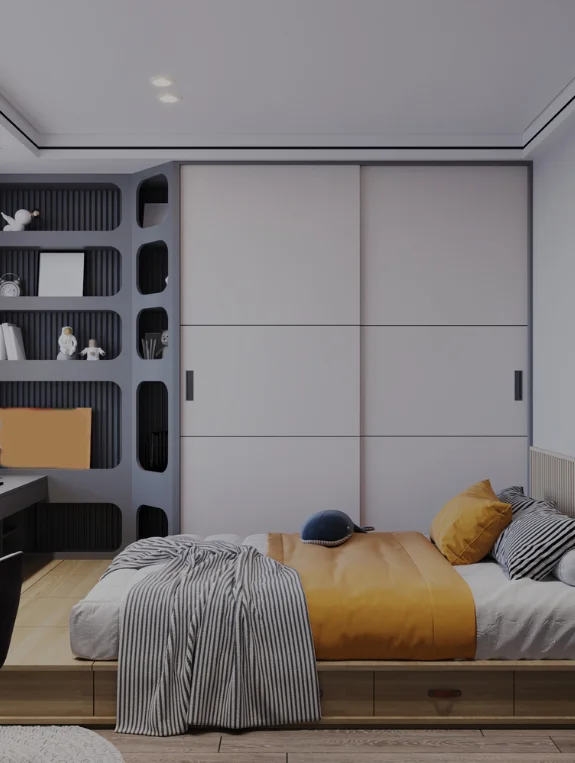
Why Decorative Abundance Reads as Decorative Chaos
More objects means more colors, more shapes, more visual noise — and a brain that never gets to rest on anything.
The most aesthetic apartments aren’t the most decorated ones. They’re the ones where your eye knows exactly where to land the moment you walk in.
That clarity only happens when there’s enough empty space around each piece to let it breathe and be seen.
The Real Problem Is That You Are Fighting for Attention With Everything at Once
Instead of one print that commands the room, you have five small prints competing with books, vases, candles, and frames — all at the same time.
Nobody wins that fight. The viewer doesn’t know what to focus on, so they focus on the busyness instead of the beauty. The individual pieces stop mattering. The overall feeling of clutter takes over completely.
The Fix Is Revealing Not Replacing — Leave 70 Percent of Your Shelf Space Empty
One plant. One book. One object. Per shelf. That’s it.
The empty space isn’t wasted — it’s working. It’s the silence in a song, the white space around a headline.
It makes the one object sitting on the shelf look three times more intentional than it ever did surrounded by ten others. Remove first. See what happens. You almost never need to add anything back.
Mistake 2 — Frame Colors and Materials That Clash and Kill Cohesion
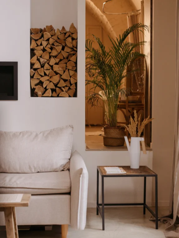
The Silent Mistake Nobody Talks About but Everyone Notices
A black frame beside a white frame beside a gold frame beside a natural wood frame.
Your eye bounces between them endlessly and never settles. Nobody consciously thinks “those frames don’t match” — but everyone feels the visual restlessness it creates.
Cohesion is what makes a space feel aesthetic. Mixed frame finishes destroy cohesion faster than almost anything else in an apartment.
Your Brain Is Counting Frame Colors Without You Realizing It
Too many frame finishes makes a room feel like a collection of individual purchases rather than a designed space.
The most aesthetic apartments use a maximum of two frame finishes throughout the entire home.
That consistency creates a quiet visual thread that ties every room together — and makes the whole apartment feel like it was put together with intention rather than assembled over time from different stores on different weekends.
The Fix Is Uncomfortable but Completely Worth It
Pick two finishes. Matte black and warm wood. Warm gold and white. Brushed silver and natural oak. Choose your two and commit completely.
Then swap every frame in the apartment into one of those two finishes. It feels extreme. It looks immediately better. The whole apartment will feel more cohesive after one afternoon of swapping than it has since you moved in.
Mistake 3 — Harsh Overhead Light That Destroys the Aesthetic Moment Every Time
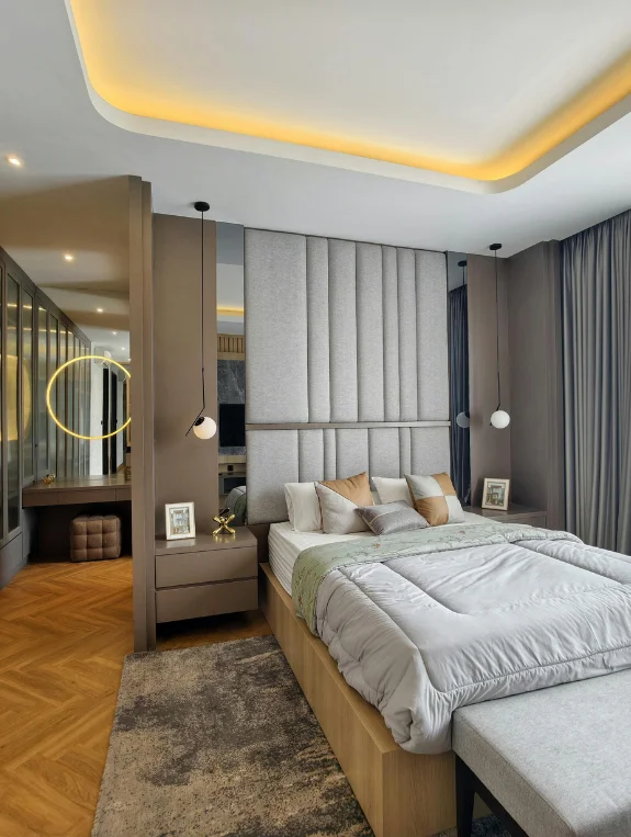
Why Your Apartment Looks Beautiful in Daylight but Wrong at Night
In natural light your apartment feels warm, soft, and genuinely beautiful.
Then the sun goes down, the overhead light comes on, and something shifts. The colors look flat. The textures disappear.
The whole room feels cold and clinical. The apartment didn’t change. The light did. And harsh overhead light destroys every aesthetic moment it touches — instantly and completely.
This Is the One Mistake That Costs Almost Nothing to Fix but Fixes Everything
Your apartment already looks its best at golden hour. That warm, layered, soft light is something you can recreate artificially — for under $15.
Warm white bulbs at 2700K in every lamp. Overhead light permanently off. That’s the entire fix. The warm light makes every color richer, every texture softer, and every piece you own look more intentional than it does under a cool white ceiling fixture.
The Fix Is About Layering Not Replacing
Don’t just swap the overhead bulb. Turn it off entirely and add warm lamps instead.
One lamp on the nightstand, one beside the sofa, one in the corner. All at 2700K warm white.
Multiple sources at different heights create the layered glow that makes aesthetic apartments feel the way they do. Overhead light flattens everything. Layered warm light makes everything come alive.
Mistake 4 — Wall Art That Looks Lost and Lonely in Too Much Space
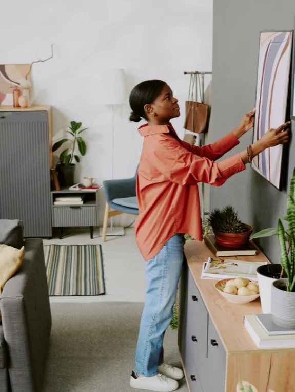
Why Three Small Prints on a Large Wall Look Like a Mistake Not a Decoration
A small print surrounded by empty wall space doesn’t create a cozy, curated feeling.
It looks abandoned. It whispers apologetically at a wall that needs something to actually say something.
The eye doesn’t know where to land so it lands on the emptiness instead — and the room ends up feeling more bare than it did before anything was hung.
This Mistake Makes You Feel Like Something Is Missing Even When You’ve Decorated
Your brain registers undersized art as incomplete — even when you can’t articulate why.
The room never feels finished. You keep thinking it needs one more thing. It doesn’t need more. It needs the right scale.
That feeling of incompleteness disappears the moment the art is sized properly for the wall it’s on.
The Fix Feels Extreme but Works Every Single Time
One large print. Two thirds the width of the wall. Hung at the right height.
That single oversized piece commands the entire room in a way three small prints stacked together never could.
The wall feels intentional. The room feels complete. The aesthetic moment you were looking for finally actually happens.
Mistake 5 — Filling Every Inch of Shelf Space Like It Is Actual Storage
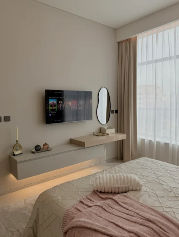
Why Styled Shelves Always Look Cluttered — And It Is Not About Having Too Much
Even beautiful, carefully chosen objects lined up across every inch of shelf space read as storage — not styling.
The problem isn’t the objects. It’s the absence of breathing room between them. A full shelf communicates accumulation.
A shelf with intentional empty space communicates design. The difference in feeling is immediate and dramatic.
The Difference Between a Styled Shelf and a Shelf Full of Stuff
A styled shelf has rhythm. Object, space, object, space. The eye moves through it with ease and pleasure.
A full shelf has no rhythm. The eye scans across it looking for somewhere to rest and never finds it. The empty space on a styled shelf isn’t wasted — it’s the design element that makes everything beside it look intentional and considered.
The Fix Changes How Every Shelf Looks Instantly
One plant on one shelf. A stack of three books on the next. Two completely empty shelves in between.
That’s the formula. The eye moves through rhythm and intention instead of scanning clutter.
Every object gets noticed. Every shelf looks more aesthetic than it did when it was completely full. Less is genuinely more here — not as a philosophy but as a visible, immediate, undeniable result.
Why These Five Mistakes Make Everything Else Look Worse
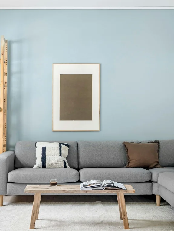
Fixing One Mistake Does Not Fix the Room — But Fixing All Five Changes Everything
These five mistakes don’t work in isolation. They pile on top of each other and create a combined feeling of visual chaos that no single beautiful piece can overcome on its own.
Fix one and you’ll notice a difference. Fix all five and you’ll barely recognize your apartment.
Every piece you already own will suddenly look better — not because anything changed about the pieces, but because they finally have the space and context to be seen properly.
The Truth About Aesthetic Apartments — They Are Not More Expensive They Are More Edited
The apartments that stop you mid-scroll aren’t filled with expensive things. They’re filled with carefully chosen things that have intentional space around them.
The investment isn’t in quantity. It’s in the discipline to remove. Every beautiful apartment you’ve ever admired got that way through editing — not through adding. That discipline is completely free and completely available to you right now.
Where to Start If Your Apartment Is Making All Five Mistakes Right Now
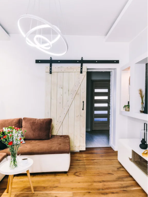
The 48 Hour Reset That Costs Nothing and Changes Everything
Remove everything from every surface. Every shelf, every table, every corner. Box it all up and live with the empty apartment for 48 hours.
Then add back only what genuinely makes you happy and serves the aesthetic you actually want. Most people find they need far less than they thought.
This one free reset fixes all five mistakes simultaneously — and it’s the fastest way to see your apartment clearly for the first time since you moved in.
The Smart Swap If Starting Over Feels Too Extreme
Start with your main wall — the most visible spot in the apartment.
Fix the frame colors. Add warm lighting. Remove the small objects. Swap to one large print.
Live with that one zone fixed for a full week and see how differently the whole apartment feels. Then move to the next zone. One area at a time, the apartment transforms without ever feeling overwhelming.
Conclusion
An aesthetic apartment is just a regular apartment with five fewer mistakes.
Edit the objects. Standardize the frames. Warm up the light. Scale up the art. Clear the shelves. Those five changes — most of them free, all of them simple — transform any apartment into the space you’ve been trying to create all along.
Start with the mistake that bothers you most. Fix that one this week. One fix creates momentum, momentum creates confidence, and confidence makes the next fix feel easy. By next month your apartment will feel completely different — and you’ll wonder why it took so long to start.