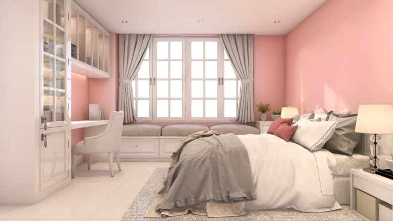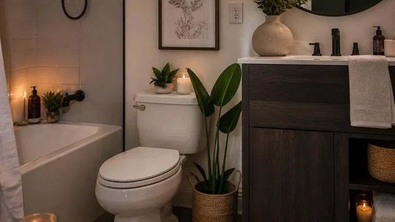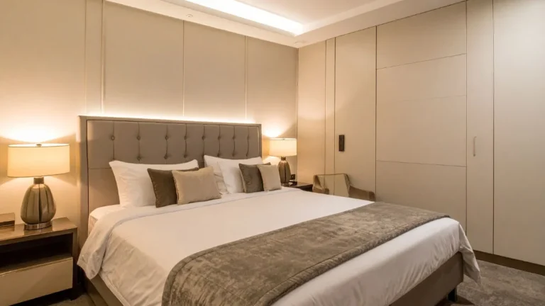
Multifunctional Small Apartment Living Room Furniture Layouts For Renters
Got a tiny living room in your rental and no idea how to make everything fit without it looking cramped?
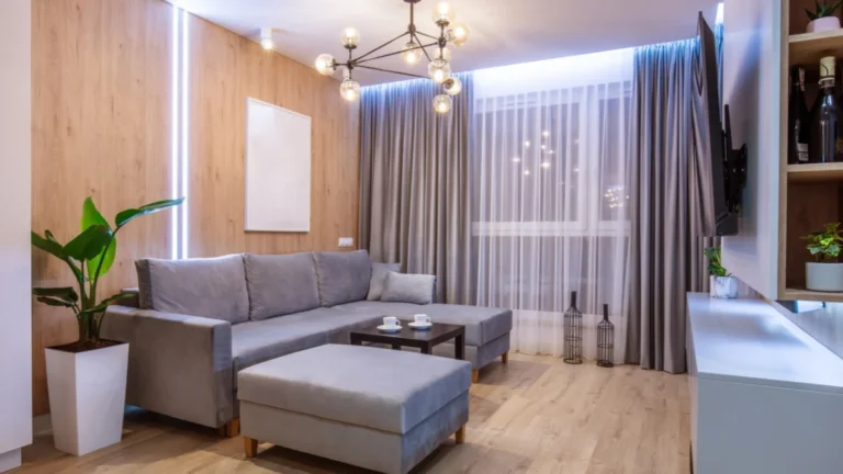
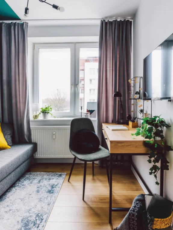
The trick is using multifunctional furniture layouts that work hard for you. Think a storage ottoman as a coffee table, a small sectional that floats off the wall, and a slim console table behind your sofa for extra space.
Keep your layout open, use a big rug to anchor it, and mount your TV to save floor space. I’m sharing my favorite renter-friendly layouts that make your small living room feel big, stylish, and actually livable.
Why Apartment Living Rooms Feel Incomplete Even When They Look Decorated
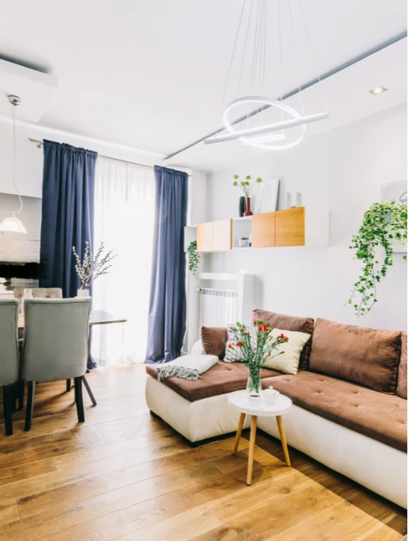
Most apartment living rooms have furniture. Some have art. Many have rugs and throw pillows.
And yet they still feel like something is missing. The problem isn’t what’s in the room. It’s what the room lacks — a clear design formula that makes everything work together.
Most People Decorate Their Living Room One Piece at a Time Without a Formula — and It Shows
A sofa chosen here. A rug bought there. Art picked up because it was on sale. None of it chosen as a system.
The result is a living room full of individual pieces that never quite feel like they belong together. Not because the pieces are wrong — but because there was never a formula connecting them.
A Formula Is What Separates a Living Room That Looks Designed From One That Just Looks Decorated
Designers don’t just have better taste. They have a system.
Scale relationships, lighting layers, color constraints, focal point hierarchy — these are the formulas that create living rooms worth photographing. And they’re available to anyone who knows what they are.
The Living Room Design Formulas That Always Work
Here’s every formula — at a glance.
- Formula 1 — Sofa width determines art width — art above the sofa is always two thirds the sofa width
- Formula 2 — Rug size always larger than feels comfortable — front legs of all seating on the rug
- Formula 3 — Three lighting sources minimum — floor lamp, table lamp, accent light — never overhead alone
- Formula 4 — Maximum three colors throughout — one dominant, one secondary, one accent
- Formula 5 — One focal point per room — everything else supports it, nothing competes
- Formula 6 — Odd numbers in every grouping — three plants, five objects, one large piece
- Formula 7 — Negative space is active design — 40 percent of surfaces always empty
- Formula 8 — One natural material repeated — wood or rattan or stone — creates cohesion
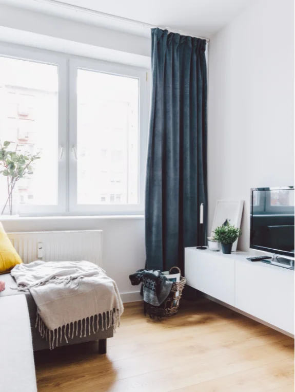
- Formula 9 — Curtains always floor to ceiling — hung four to six inches below ceiling
- Formula 10 — The sofa never touches the wall — minimum 12 inches from every wall
The Formula That Fixes More Living Rooms Than Any Other
Formula 10. The sofa away from the wall.
Pulling the sofa 12 to 18 inches from the wall — floating it in the room — creates an immediate sense of intention and scale that wall-hugging furniture never achieves. This single formula application makes the living room feel larger, more designed, and more intentional before anything else changes.
Formula 1 — The Art Sizing Rule That Makes Walls Look Professional
Why Art Above the Sofa Fails When It Is the Wrong Size
A small print above a large sofa looks apologetic. It draws attention to the empty wall around it rather than to the art itself.
The eye registers the scale mismatch as a design error — even when the viewer can’t identify exactly what’s wrong. The room feels slightly off. The art feels like an afterthought. The sofa feels unsupported.
The Two Thirds Rule That Professional Designers Apply Every Time
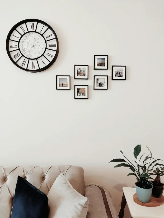
Art above the sofa should span two thirds of the sofa width. Nothing narrower.
A 90-inch sofa needs art that spans 60 inches minimum. A 72-inch sofa needs 48 inches of art — whether that’s one large piece or a gallery arrangement that collectively spans that width. The formula is simple. The result is immediate and dramatic.
The Gallery Arrangement That Achieves the Two Thirds Rule on a Budget
Three prints in coordinating tones arranged horizontally, collectively spanning two thirds of the sofa width.
Each print can be an Etsy digital download printed at Costco for under $15. Three prints in matching IKEA frames collectively span the required width — at a total cost of under $100 for an arrangement that reads as gallery quality.
Formula 2 — The Rug Size Rule That Defines the Living Zone
Why Small Rugs in Living Rooms Make Everything Look Wrong
A small rug in a living room doesn’t define a zone — it creates an island in the middle of the furniture that makes everything around it look disconnected and uncertain.
The brain reads a small rug as an accident. A properly sized rug reads as a deliberate architectural decision. Same rug, completely different reading based entirely on size relative to the furniture.
The Correct Rug Sizing for Every Living Room Configuration
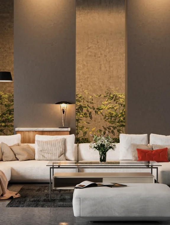
Front legs of every seating piece sitting on the rug minimum. Ideally all legs of all furniture on the rug.
For a standard apartment living room this means a rug no smaller than 8×10 feet. Most people buy 5×7 and wonder why the room never looks right. The 8×10 rug that feels too large in the store is almost always exactly right in the room.
The Budget Rug That Achieves Correct Size Without a Large Investment
Amazon and Wayfair both carry 8×10 jute or woven rugs for $60 to $100.
A properly sized affordable rug always looks better than an expensive rug in the wrong size. Buy the size first. Budget for quality second. Size is the formula. Quality is the preference.
Formula 3 — The Lighting Layer Rule That Creates Atmosphere
Why One Overhead Light Makes Even Beautiful Living Rooms Look Flat
A single overhead light source creates even, shadowless illumination that removes all depth from a room.
Every texture looks flat. Every material looks ordinary. Every design decision made in daylight looks slightly wrong under harsh overhead. The formula that fixes this costs under $100 and takes one afternoon.
The Three Layer Lighting System That Every Designed Living Room Has
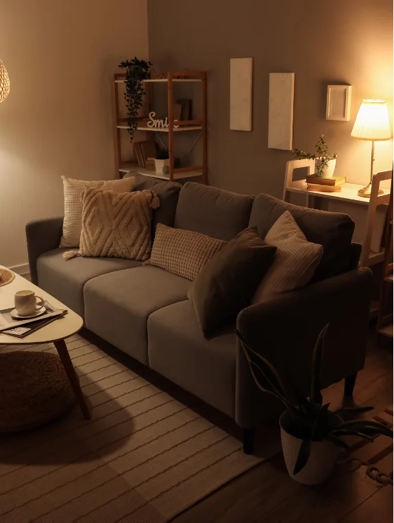
Layer 1 — One warm floor lamp in the darkest corner. Layer 2 — One warm table lamp on the side table or console. Layer 3 — String lights or LED strips as accent.
All three at 2700K warm white. Overhead permanently off during evening hours. The three layers together create the depth, warmth, and atmosphere that makes living rooms look and feel dramatically more designed than single-source lighting ever could.
The Dimmer Addition That Completes the Lighting Formula
A smart bulb or inline dimmer on the floor lamp — adjustable from 20 to 80 percent based on the evening’s activity.
Movie watching at 20 percent. Entertaining at 60 percent. Reading at 80 percent. The adjustable foundation lamp makes the entire lighting system responsive to how the room is actually being used — and that responsiveness reads as sophisticated design intention.
Formula 4 — The Three Color Rule That Creates Visual Cohesion
Why Too Many Colors Make Living Rooms Feel Chaotic
Every color added beyond three creates another visual demand on the attention.
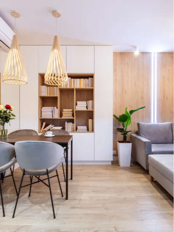
Three colors — dominant, secondary, accent — create a palette the eye understands and settles into. Four colors create tension. Five create chaos. The constraint of three is what allows the eye to rest and the room to feel calm and intentional.
The Three Color Living Room Palette That Works at Every Budget
Warm white as the dominant — walls, large furniture, curtains. Warm wood as the secondary — coffee table, shelf, lamp base. Terracotta or sage as the accent — two throw pillows, one plant pot, one small object.
These three work together in every apartment, in every light condition, at every budget. The palette is the formula. The specific pieces are the preference.
How to Apply the Three Color Rule to an Existing Living Room
Photograph the room. Count the colors present. Identify the two or three colors that appear most. Remove or replace everything that doesn’t belong to those colors.
The audit takes 20 minutes. The removal is free. The result is a living room that suddenly reads as cohesive — using only what was already there, just edited down to the formula.
Formula 5 — The Focal Point Rule That Organizes Every Other Decision
Why Living Rooms Without a Focal Point Feel Unsettled
When every element in a room competes for attention equally, the eye never settles anywhere.
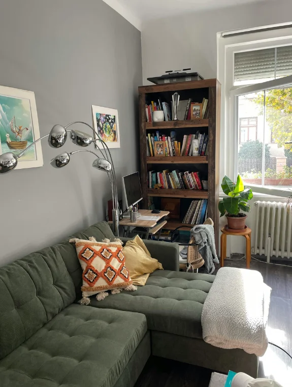
The brain experiences this as visual restlessness — the living room equivalent of a conversation where everyone talks at the same time. A focal point gives the eye somewhere to land first — and that single landing point organizes every other element in the room around it.
The Three Focal Point Options That Work in Every Living Room
One large art piece above the sofa — the most common and most powerful focal point. A statement fireplace or TV wall — the architectural focal point. One large mirror that reflects light and creates visual depth — the functional focal point.
Every other element in the room supports whichever focal point is chosen. Nothing competes with it. Everything reinforces it.
How to Create a Focal Point in a Living Room That Has None
Choose the wall that faces the main seating. Place the largest, most beautiful thing you own on that wall.
If nothing you own is large enough — one Etsy print printed large at Costco in an IKEA frame for $43 creates an immediate focal point. The formula doesn’t require expensive art. It requires art that is correctly sized and correctly placed.
Formula 6 — The Odd Number Rule That Makes Every Grouping Look Intentional
Why Even Numbers in Groupings Always Look Slightly Off
Two plants, four candles, six objects on a shelf — even numbers create a symmetry that reads as arranged rather than collected.
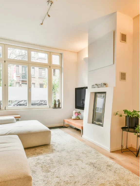
Odd numbers — three plants, five objects, one large piece — create a visual rhythm that the eye reads as natural and organic. The odd number formula is the difference between a shelf that looks styled and one that looks like a designer put it together.
The Three Object Shelf Rule That Works Every Single Time
One tall element. One medium element. One small element. Always in odd numbers. Always at different heights.
This three-object formula works on every surface in every room. Coffee table, nightstand, bookshelf, bathroom counter — the formula is universal. Apply it consistently and every surface in the living room reads as intentionally designed.
The Five Plant Rule That Creates a Living Corner
One tall plant. One medium trailing plant. One small plant. Two plants at different intermediate heights.
Five plants in one corner, five different heights, five different textures — the living corner that reads as a genuine biophilic design moment rather than a collection of plants someone bought without a plan.
Formula 7 — The Negative Space Rule That Signals Luxury
Why Full Shelves and Crowded Surfaces Read as Budget
Surfaces filled to capacity signal accumulation — the visual result of adding without editing.
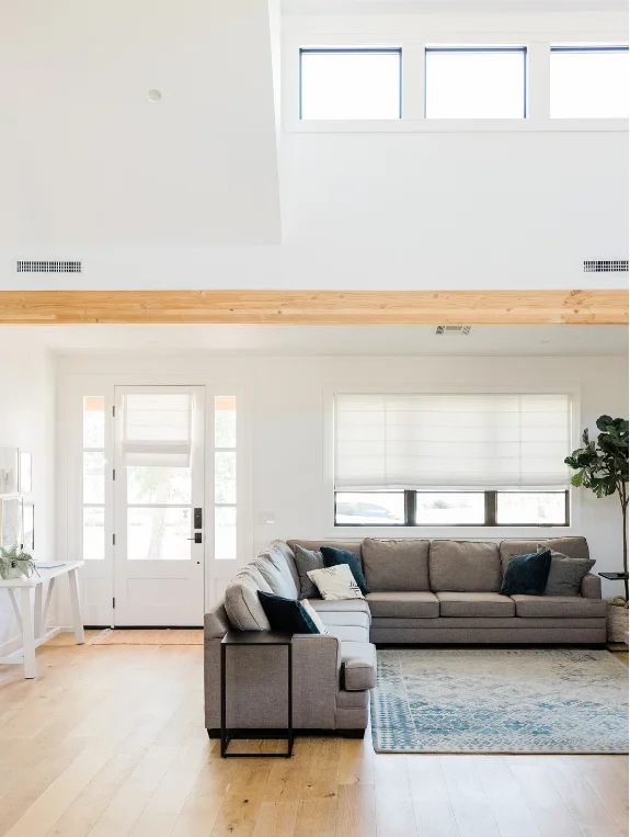
Empty space on a shelf signals choice — the visual result of deciding what deserves to be there and removing everything that doesn’t. That choice reads as luxury in a way that fullness never does. The formula is 40 percent empty. Protect it.
The 40 Percent Empty Rule Applied to Every Surface
Coffee table — maximum three objects with visible empty space around each. Bookshelf — books on two thirds, empty or lightly styled on one third. Console — one lamp, one plant, one object — everything else cleared.
The 40 percent empty formula applied consistently across every surface in the living room creates a cohesive luxury reading that no amount of beautiful individual objects can create when they’re crowded together.
The One Week Edit That Reveals Whether the Formula Is Working
Remove 40 percent of everything on every surface. Live with it for one week.
Most people never put things back. The living room that felt bare after the edit reads as luxury by day three — and the formula becomes self-reinforcing because the result is so immediately and obviously better.
Formula 8 — The Repeated Material Rule That Creates Cohesion
Why One Material Repeated Creates Cohesion That Multiple Materials Cannot
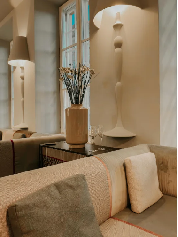
Warm wood on the coffee table, warm wood on the shelf bracket, warm wood on the lamp base, warm wood on the picture frame.
The repetition creates a visual thread that ties the entire room together — not obviously, not loudly, but consistently. The room feels designed because one material decision was made once and honored throughout.
The Three Material Families That Work Best in Apartment Living Rooms
Warm wood — honey oak, walnut, or teak tones repeated in furniture, frames, and accessories. Warm brass — lamp bases, picture frames, hardware, and accent pieces. Natural rattan — baskets, lamp shades, mirror frames, and decorative objects.
Choose one family. Repeat it in every room. The cohesion this creates is the most powerful single design decision available in any apartment.
How to Audit the Current Room for Material Consistency
Photograph every material currently in the living room. Identify the most common material family. Remove or replace everything that doesn’t belong to that family or to its natural complement.
The audit is free. The editing is free. The result is a living room that reads as professionally designed — using only the objects already in the room, organized by a formula.
Where to Find the Pieces That Support These Formulas
Best Sources for Scale-Correct Art and Rugs
Etsy for large format digital downloads at $5 to $8 — printed large at Costco for $15, framed at IKEA for $20. Amazon and Wayfair for 8×10 rugs at $60 to $100 that meet the formula size requirement at budget prices.
Best Sources for Lighting Layers and Natural Materials
Amazon for floor lamps, string lights, and warm bulbs at every price point. West Elm for quality natural material furniture and accessories that honor the repeated material formula beautifully. IKEA for affordable frames, shelving, and basics that form the structural backbone of every formula.
Conclusion
The living room that looks designed is built on formulas — not on budget, not on taste, not on luck.
Art two thirds the sofa width. Rug larger than comfortable. Three lighting layers. Three colors maximum. One focal point. Odd number groupings. Forty percent empty. One repeated material. Curtains at ceiling height. Sofa away from the wall.
Ten formulas. Any budget. Any apartment. Any aesthetic.
Apply Formula 10 tonight — pull the sofa away from the wall. Apply Formula 3 this week — add one warm floor lamp and turn the overhead off. Apply Formula 1 before the month ends — hang art at two thirds the sofa width.