Tacky Apartment Decor Baddie Choices Ruining the Luxury Hypebeast Vibe
Trying to get that luxury hypebeast baddie vibe but your apartment still feels cheap and tacky? The biggest culprits are harsh rainbow LED strips, fake designer logos everywhere, and way too much clutter on every surface.
Swap them for warm soft lighting, one or two real statement art pieces, and clean, open space. Stick to a neutral color palette with gold or black accents to make everything look instantly expensive and boujee. I’ll show you exactly what to remove and what to keep to get that clean, luxury, Instagram-ready look fast.
The Difference Between Expensive Baddie and Cheap Baddie Is Smaller Than You Think
Baddie Apartment Decor That Reads as Luxury Makes Specific Choices — The Wrong Choices Flip It to Tacky Instantly
The baddie aesthetic looks bold and confident when it’s done right, and cheap or try-hard the moment a few small choices go wrong.
The line between the two really isn’t about how much money got spent. It comes down to a handful of specific decisions that either work in your favor or quietly work against you.
These Are the Exact Choices That Are Secretly Undercutting Your Baddie Apartment Aesthetic
Once you start noticing these mistakes, they’re genuinely impossible to unsee. The good news is that once they’re fixed, the apartment stops reading as decorated and starts reading as actually designed.
The Tacky Baddie Mistakes at a Glance
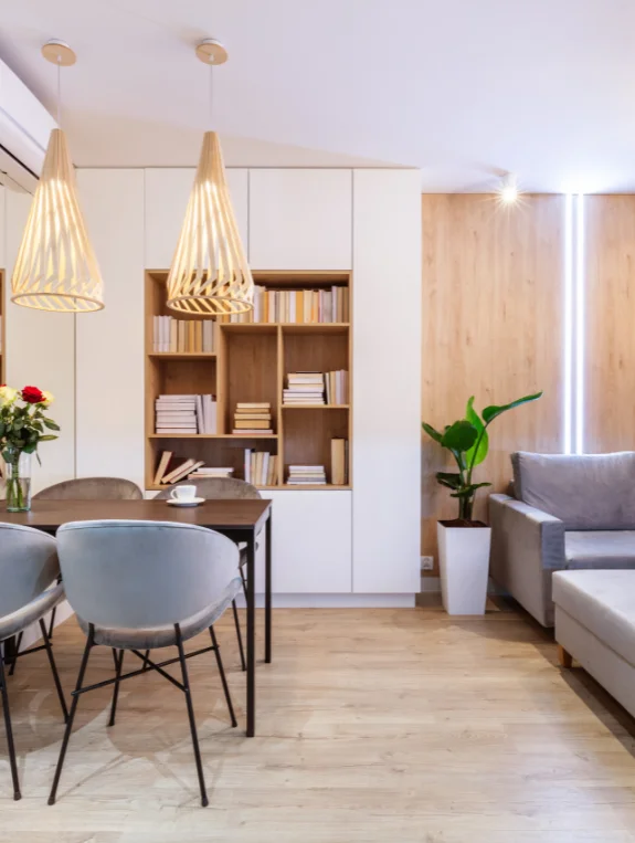
The Complete Tacky Baddie Mistake List
- Too many LED colors competing at once — pink, purple, and blue all fighting instead of complementing
- Visible branding on everything, which reads as trying rather than having
- Cheap faux fur that looks matted and obviously synthetic
- Neon signs spelling out words or phrases, one of the most dated choices available
- Rose gold overload, where every single item is the same finish
- Mirrors everywhere with no editing — walls, furniture, and accessories all mirrored at once
- Cheap polyester velvet with a plastic sheen
- Too many competing statement pieces in one room
- Fast fashion home decor that visibly looks like an $8 vase
- Dark walls paired with cool, harsh overhead light
The Mistake That Destroys Baddie Aesthetics Fastest
Out of everything on this list, LED color chaos does the most damage the fastest. Pink strips behind the bed, purple in the corner, and blue under the dresser all competing at once tends to create a gaming room rather than a luxury apartment.
One dominant color used consistently throughout the space is what actually reads as intentional.
Mistake 1 — LED Color Chaos That Reads as Bedroom Gaming Setup
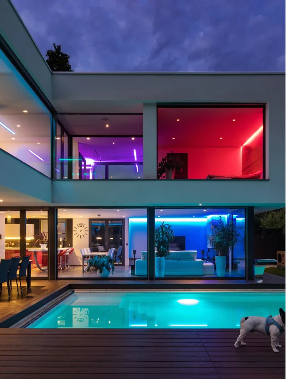
Why Multiple LED Colors Kill the Luxury Baddie Vibe Immediately
Luxury spaces, even bold ones, tend to have real color discipline behind them, telling one consistent color story rather than several competing ones.
Multiple LED colors fighting for attention usually signal that the room was decorated on impulse rather than with any real intention. It’s one of the fastest ways to undercut an otherwise great space.
The One LED Color Approach That Reads as Luxury
Picking a single dominant LED color, whether that’s warm deep rose, warm purple, or warm amber, and using it consistently behind the bed, along shelf edges, and as the accent throughout, reads as genuinely designed rather than accumulated over time. Consistency is really doing all the work here.
The Warm White Plus One Color Combination That Works Best
Using warm white LEDs as the base everywhere, with one accent color reserved for the single most important spot in the room, is the formula that tends to work best.
Warm white plus one intentional accent color is basically the luxury baddie lighting rule to build everything else around.
Mistake 2 — Cheap Faux Fur That Makes the Room Look Like a Halloween Store
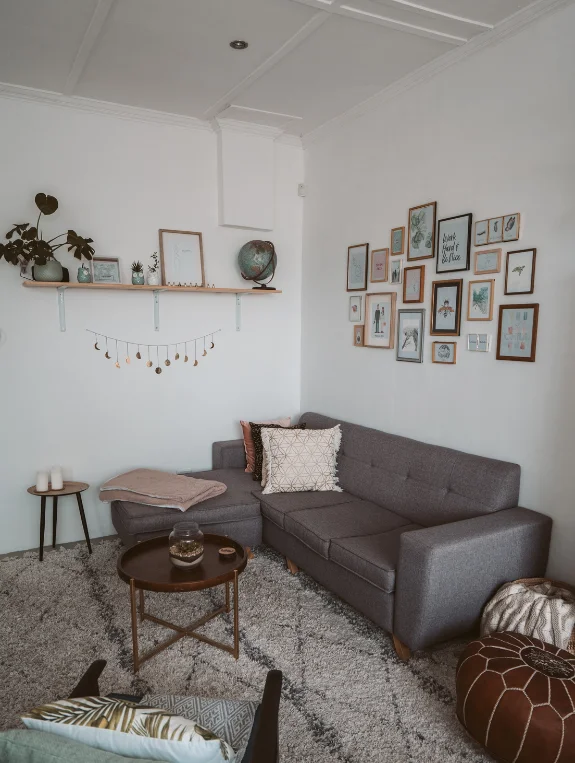
Why Low Quality Faux Fur Is the Most Obvious Luxury Fail
Cheap faux fur tends to have an obvious plastic sheen and mats down within a few weeks of use, which makes it read more like a costume prop than a genuine luxury textile.
It’s one of the fastest ways for an otherwise great room to lose its credibility. Faux fur done wrong communicates the exact opposite of what it’s meant to.
How to Identify Quality Faux Fur Before Buying
Look for a thick pile that springs back when you press it, no visible plastic sheen, consistent color throughout, and real weight to the fabric.
If you blow gently into the pile, the roots shouldn’t be visible. Quality faux fur genuinely reads as luxurious, while the cheap kind reads as synthetic from across the room.
The Alternative Textiles That Deliver Luxury Without the Faux Fur Risk
Quality velvet, heavy boucle, and real sheepskin all deliver the same warmth and texture without the risk that comes with gambling on faux fur quality.
West Elm and CB2 both carry options at price points that genuinely justify the quality. These alternatives tend to be a safer bet overall.
Mistake 3 — Neon Signs That Date the Aesthetic Instantly
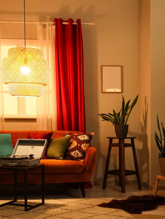
Why Neon Signs Are the Most Dated Baddie Apartment Choice
Neon signs were everywhere between roughly 2018 and 2020, and they’ve since become one of the quickest markers of a dated apartment aesthetic.
An apartment trying to feel current with a neon phrase sign hanging on the wall tends to read as several years behind instead. It’s one of the easier decor choices to update.
The Alternative That Delivers the Same Energy Without Dating the Room
A large LED-framed backlit mirror, a Hollywood vanity mirror with warm bulbs, or a framed neon art piece from an independent artist all deliver similar glow energy without the dated word-sign association.
These alternatives tend to feel current rather than nostalgic. They’re worth considering as a direct swap.
If You Love Neon — The One Way to Use It That Still Works
For anyone who still loves the neon look, one neon art piece in an unexpected shape rather than a phrase, like a neon moon or an abstract form, reads as artistic rather than trend-driven.
It’s a way to keep the glow without the dated word-sign feel. The key difference is shape over text.
Mistake 4 — Too Many Statement Pieces That Cancel Each Other Out
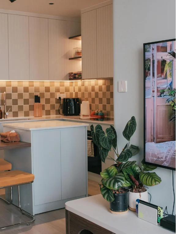
Why a Room Cannot Have Ten Statement Pieces
A statement piece only works because it has something simpler to contrast against, the way a velvet sofa stands out beside a plain rug.
That same velvet sofa becomes noise the moment it’s surrounded by a faux fur rug, a mirrored coffee table, a neon sign, and an LED mirror all at once. Too many statements simply cancel each other out.
The One Statement Per Room Rule That Makes Baddie Read as Luxury
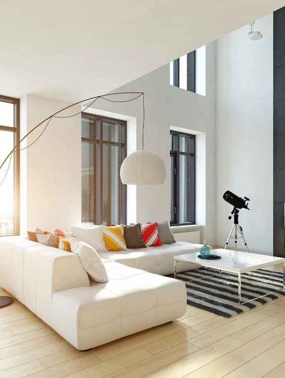
Choosing one dominant statement per room, like a vanity mirror in the bedroom or a velvet sofa in the living room, lets everything else support that piece instead of competing with it. This single rule does more for the overall look than almost any individual purchase. Restraint really is what elevates the whole space.
The Edit That Reveals Which Statement Pieces to Keep
Removing everything from the room, adding back one piece at a time, and assessing whether it genuinely reads as a statement before adding the next is a genuinely useful exercise.
The first piece added should be the one true statement, with everything after it serving that piece rather than competing with it. It’s a slower process, but it usually reveals exactly what the room actually needs.
Mistake 5 — Dark Walls Plus Harsh Overhead Light
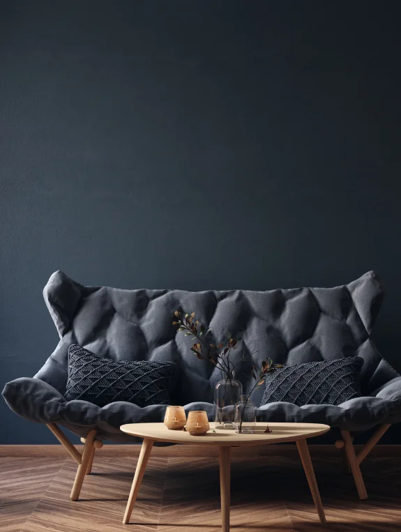
Why This Combination Makes Baddie Look Depressing Not Luxurious
Dark walls need warm, layered lighting to create a genuinely luxurious atmosphere, but dark walls paired with a harsh overhead fluorescent light tend to create a dim, institutional feeling instead.
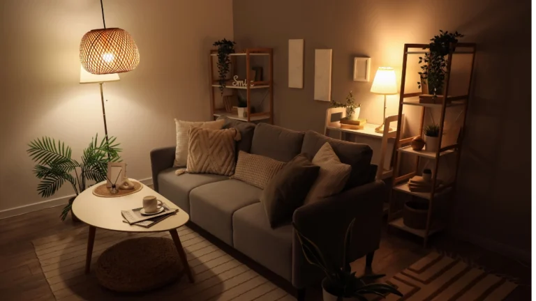
A moody baddie apartment really needs at least four separate warm light sources to feel intentional rather than gloomy.
The Lighting Setup That Makes Dark Baddie Walls Look Expensive
A floor lamp at around 50 percent brightness, LED strips behind the bed in one warm accent color, two warm bedside lamps, and candles across a few surfaces, with the overhead light permanently off, create a dark room that glows instead of broods. This combination is really what separates moody-luxurious from moody-depressing.
The 2700K Rule That All Baddie Apartments Must Follow
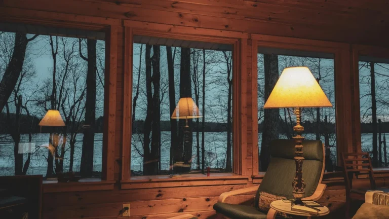
Every bulb in a dark baddie apartment should sit at 2700K warm white at minimum. Cool light in a dark room tends to create a cold, institutional feeling, while warm light in that same dark room creates genuine intimacy. Temperature really is the single decision that saves this whole aesthetic.
The Corrected Baddie Apartment That Reads as Luxury
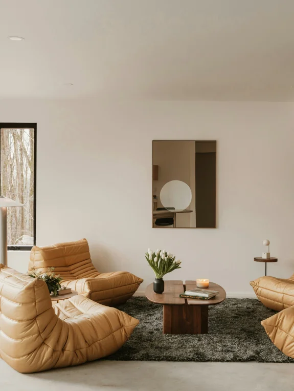
What the Fixed Baddie Apartment Looks Like
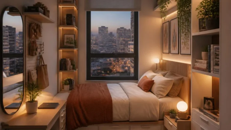
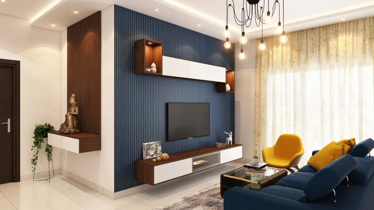
One consistent LED color story, quality velvet textures, no neon signs, one clear statement per room, and warm layered lighting against dark walls together create a baddie apartment that reads as genuinely designed rather than aggressively decorated. Every piece here is doing intentional work rather than fighting for attention.
The Free Edits That Fix the Most Common Baddie Mistakes Tonight
Removing all but one LED color, turning off the overhead light permanently, and removing two of the five current statement pieces are all free changes that move the aesthetic from try-hard toward genuinely designed almost immediately. None of them require spending a single dollar.
The Budget Upgrade That Elevates the Entire Baddie Room
Swapping in one quality velvet throw pillow in a deep jewel tone in place of cheap faux fur immediately raises the material quality signal in the whole room.
It’s roughly a $28 upgrade from Target that changes how the entire space reads. Small material swaps like this tend to punch well above their price.
Where to Find Baddie Luxury That Does Not Look Tacky
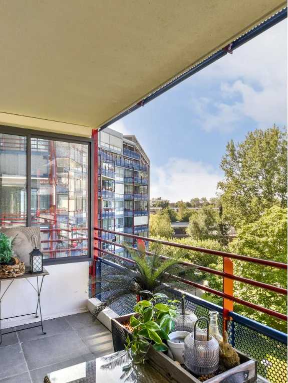
Best Sources for Quality Baddie Textures and Materials
West Elm carries quality velvet throws and pillows, CB2 offers bold pieces with genuine material quality, and Amazon has a wide selection of LED strips with warm color options and dimming control.
Best Sources for Baddie Art and Statement Pieces
Etsy is a strong source for unique artistic pieces that read as genuinely designed rather than pulled straight from a trend store, while Society6 offers bold artistic prints. Independent local artists are also worth seeking out for truly one-of-a-kind pieces.
Conclusion
The luxury baddie apartment really comes down to one LED color, one statement piece per room, and quality materials used consistently throughout.
These three disciplines, color consistency, statement editing, and material quality, are exactly what separates a baddie apartment that reads as genuinely expensive from one that reads as trying to look expensive.
The best place to start is tonight, by turning off every LED color except one and switching off the overhead light entirely, since those two free changes alone can move the whole aesthetic from chaotic to curated before spending another dollar.