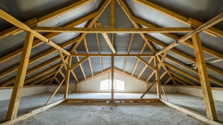

Attic Wall Paint Mistakes Making Slanted Boundaries Feel Heavier Than the Actual Walls
Painting slanted attic boundaries in dark, heavy colors and using two different bold tones makes walls feel lower and heavier.
Glossy finishes, harsh contrast lines, and painting the low slant darker than the tall wall also weigh it down. Using the same light creamy tone across all angles keeps it seamless and tall.
Light matte paint bounces natural light and makes slanted boundaries disappear instead of feeling like a heavy box. One continuous soft color makes low attics feel airy, open, and intentionally designed. It instantly makes your attic feel bigger, calmer, and way more expensive.
Paint Is the Fastest Way to Make a Slanted Attic Room Better or Worse

The Right Paint Choice Opens a Slanted Attic — the Wrong One Closes It Down Completely
Two identical attic rooms, one painted warm white throughout with a lighter ceiling, one painted dark throughout with no contrast, can feel like completely different spaces. The first feels twice as large, the second feels like a cave. That’s how powerful the paint decision really is in a slanted room.
Slanted Walls Behave Differently From Flat Walls — They Need a Different Painting Strategy
On a flat wall, a dark color reads as bold. On a slanted wall, that same dark color reads as pressing down. The angle genuinely changes how a color psychologically registers, and understanding that is the foundation of every correct attic paint decision.
The Attic Paint Mistakes in One View
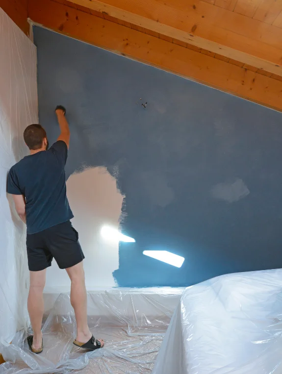
The Complete Attic Paint Mistake List
- The same dark color on walls, ceiling, and slope, unifying every surface into one heavy mass
- Cool grey or blue on the slope, reading as cold and heavy at once
- High sheen finishes on low ceiling slopes, reflecting light harshly
- No color differentiation between slope and vertical walls
- Dark color on the knee wall vertical sections, deepening the room’s lowest, most constrained point
- Warm dark on north-facing slopes that never receive direct light
- Beams painted the same dark color as the slope, turning them into heavy visual bars
- Stopping the wall color at the slope rather than continuing it to the ceiling
The Single Worst Attic Paint Decision
Out of everything on this list, painting the slope and ceiling the same dark color with no contrast does the most damage.
Without any visual hierarchy, the eye can’t distinguish where the wall ends and the ceiling begins, and the whole room ends up reading as a dark enclosure rather than a designed space.
Mistake 1 — No Color Contrast Between Ceiling and Slope

Why Contrast Between Ceiling and Slope Is Essential in Attic Rooms
The ceiling and the slope are genuinely separate architectural surfaces, and painting them identically merges them visually, causing the room to lose its sense of defined space. Even a subtle contrast between the two creates real visual separation and a perceived boost in height.
The Contrast Formula That Works in Every Attic
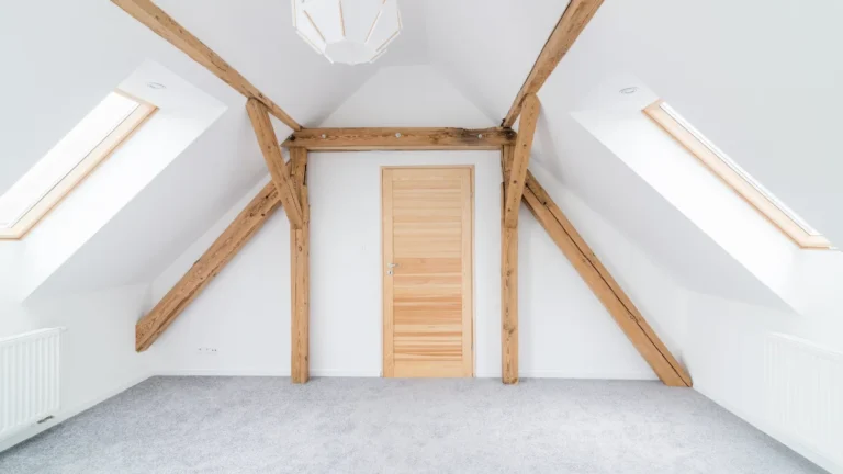
Painting the ceiling one shade lighter than the slope, or the ceiling in bright white with the slope in the chosen color, lets the lighter surface recede visually so the room reads as taller. It’s a simple formula that works regardless of the specific color family chosen.
Testing the Contrast Before Committing to a Full Paint
Applying a test patch of the proposed ceiling color right beside the slope color, then viewing it from the room entry point at different times of day, confirms the contrast reads well in both morning light and evening artificial light before committing to a full paint job.
Mistake 2 — Cool Tones on Slanted Surfaces That Already Feel Heavy
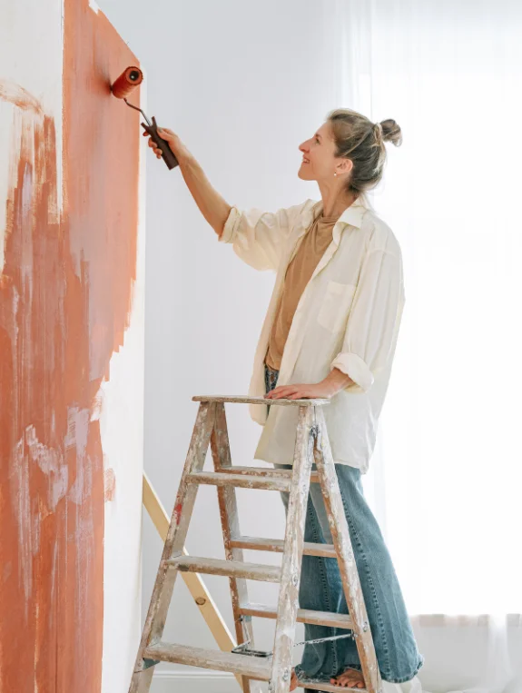
Why Cool Colors Make Slanted Walls Feel Colder and Heavier
Cool grey, cool blue, and cool white all tend to advance toward the viewer on a vertical surface, and that advancing quality is amplified on a slanted surface angled toward the person in the room. The result is a slope that feels like it’s leaning inward.
The Warm Undertone Rule for Every Attic Paint Choice
Every paint chosen for an attic slope should carry a warm undertone, yellow, red, or orange based, since warm undertones recede slightly on an angled surface instead of advancing. It’s the real difference between a slope that feels comfortable and one that feels oppressive.
The Specific Warm Whites That Work Best on Attic Slopes
Benjamin Moore’s White Dove carries a warm yellow undertone, Farrow and Ball’s All White has a warm chalk base, and Dulux’s Jasmine White in the UK offers a warm cream undertone. All three are proven choices for attic slopes across the USA, UK, and Canada.
Mistake 3 — High Sheen Paint on Low Slanted Ceilings

How Gloss and Satin Finishes Compress Attic Rooms Visually
A high sheen finish on a slanted surface reflects light back at an angle, creating harsh lines that emphasize the slope even more. The room ends up reading as smaller, since every reflection reinforces just how close that surface actually is.
The Finish That Makes Attic Slopes Look Their Best
A flat matte or eggshell finish on slopes and ceilings absorbs light rather than reflecting it, letting the slope read as a quiet background instead of a dominant visual element. Matte finishes are really what make color recede instead of advance.
The One Surface Where Sheen Is Acceptable in Attic Rooms
The vertical knee wall sections at the lowest boundary of the room can handle a slight eggshell finish, since it creates a subtle visual separation from the matte slope above without compressing the overall space.
Mistake 4 — Dark Knee Walls Making the Lowest Area Feel Smallest
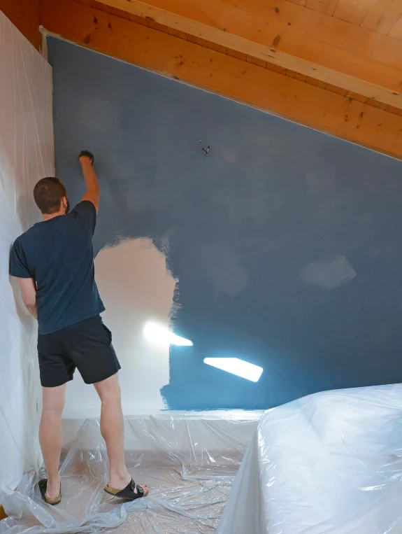
Why Dark Paint on the Lowest Attic Walls Is the Most Oppressive Choice
The knee wall sections already sit at the lowest, most constrained point of an attic room, and painting them dark only amplifies that constraint. The eye reads the dark lower boundary as closer than it actually is, making the room feel physically smaller right at floor level.
The Light Knee Wall Approach That Lifts the Whole Room
Painting the knee wall vertical sections in the lightest version of the chosen palette, or in bright white, lets the lowest boundary recede visually. The room reads as opening outward at floor level rather than closing in, a real visual expansion that costs nothing more than a paint decision.
The Two-Tone Strategy That Creates Visual Height
Knee walls in warm white, slopes in a slightly deeper warm neutral, and the ceiling in bright white together create a graduated three-tone approach that reads as genuinely intentional design and maximizes the sense of vertical space in any attic room.
Mistake 5 — Painting Beams the Same Color as the Slope
When Dark Beam Color Creates Visual Cage Bars
Beams painted dark on a dark slope become nearly invisible structural elements, while the same beams painted a contrasting color become genuine architectural features.
Beams painted dark on a light slope, though, become heavy bars that seem to press across the room. The relationship between the beam color and the slope color matters more than the beam color alone.
The Beam Color That Reads as Architectural Feature
Beams in warm white on a warm white background nearly disappear, giving the room visual calm, while beams in a warm dark wood stain against a white background become deliberate architectural features. Both approaches work. It’s the middle ground, dark paint on a medium-tone background, that creates the cage effect.
The Whitewash Beam Treatment That Lightens Without Erasing
A diluted white paint wash over existing dark beams lets the wood grain show through while significantly lightening the overall tone, turning heavy dark bars into warm architectural details.
It’s a treatment that costs about $20 in paint and transforms one of the most oppressive beam situations available.
The Correct Attic Paint Strategy by Room Type
The Bedroom Attic — Warm and Calm Above Everything
Warm white throughout, with the ceiling lightest, the slope slightly deeper warm white or pale greige, knee walls in warm white, and beams either matching the slope or whitewashed, creates a palette that makes sleeping under a slope feel like genuine shelter rather than compression.
The Home Office Attic — Light and Focused
Bright warm white on slopes and ceiling, with one flat gable wall in soft warm sage or greige for focus, and no dark tones on any angled surface, keeps a working environment feeling energized and visually open throughout the day.
The Bold Accent Attic — How to Use Color Without Oppression
Keeping one flat gable wall in the chosen bold color, while every sloped and ceiling surface stays warm white, confines the boldness to the one surface that doesn’t press toward the occupant, delivering personality without any of the oppressive weight.
Where to Find the Right Attic Paint
Best Paint Sources in the USA and Canada
Benjamin Moore offers White Dove and a strong warm neutral range, Sherwin-Williams covers warm white and greige options, and Home Depot carries BEHR’s warm neutral paint at an accessible price point.
Best Paint Sources in the UK
Farrow and Ball offers premium warm chalky whites, Dulux carries accessible warm white ranges including Jasmine White, and Little Greene is worth checking for quality warm tones across both historic and contemporary palettes.
Conclusion
Attic paint mistakes are almost always about tone, contrast, and finish, not just the color chosen. A warm undertone on every slope, a ceiling always lighter than the slope, a matte finish on all angled surfaces, light knee walls, beams in white or natural wood, and three tones graduated from floor to ceiling together correct essentially every oppressive attic paint situation.
Testing three warm white samples on the slope before committing to a full paint job, worth the $15 in test pots, is far cheaper than redoing an $80 paint job once it’s already on the walls.